Look & Feel
Customize the appearance, branding, and theming of your agent's chat interface across Web App, Sidebar, and Floating Widget modalities.
Overview
The Look & Feel page allows you to brand your agent's chat interface to match your company's visual identity. It provides separate theming controls for Web App/Sidebar and Floating Widget modalities, plus granular customization of individual UI components.
Accessing Look & Feel:
- Navigate to My Agents
- Click the three-dot menu on the agent card
- Select Look and Feel
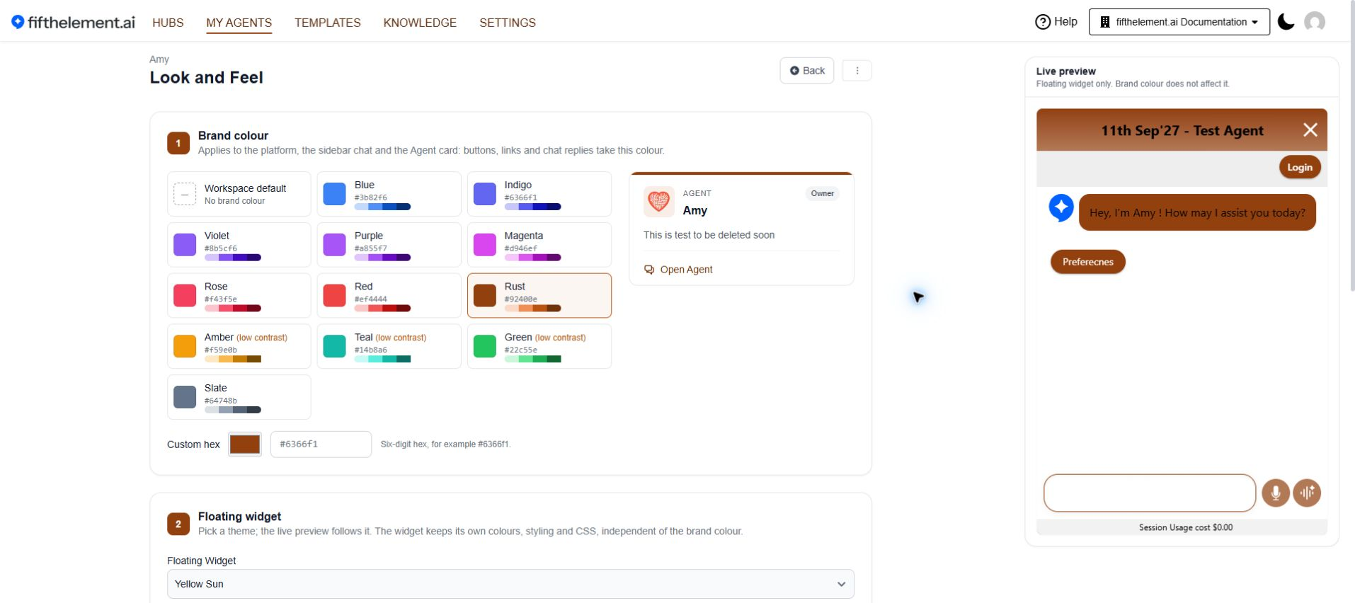
The page has three numbered sections: Brand colour, Floating widget and Sidebar. The live preview shows the floating widget only.
Brand Colour
Choose a colour preset, Workspace default, or a six-digit Custom hex value. The brand colour applies to platform surfaces, sidebar chat and the agent card, including buttons, links and chat replies.
Options:
- Choose a preset tile, such as Blue, Indigo, Violet or Rust
- Enter a six-digit value in Custom hex, for example
#6366f1 - Review the low contrast labels on Amber, Teal and Green before choosing them
Scope
The floating widget keeps its own theme, colours and CSS. Its live preview is independent of Brand colour.
Sidebar — Custom CSS
The Sidebar section on the Look & Feel page exposes a dedicated Sidebar Custom CSS field. Admins and embedding consumers can supply CSS scoped to the Sidebar modality, so the assistant visually integrates with the host application instead of appearing disconnected. Brings the Sidebar to parity with Floating Widget, which already supports custom CSS.
| Field | Description |
|---|---|
| Sidebar Custom CSS | Custom CSS rules scoped to the Sidebar modality. Match host-application typography, colors, spacing and border treatments so the Sidebar no longer reads as a foreign element on the page |
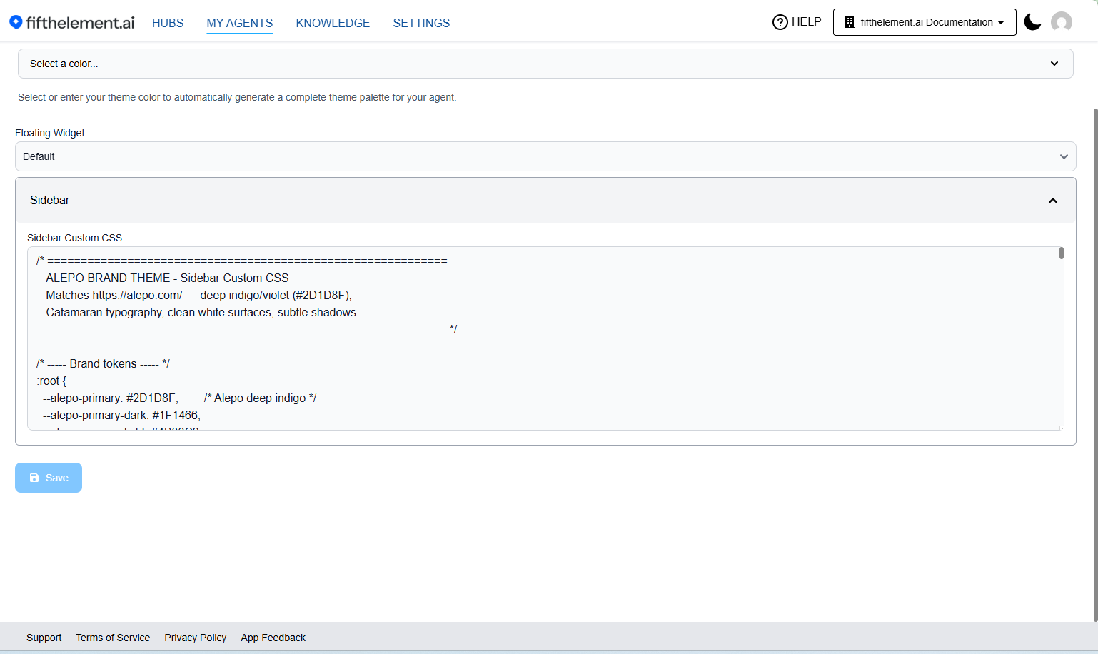
Sidebar Custom CSS applies when chat is rendered as the sidebar inside an iframe. The adjacent live preview shows the floating widget.
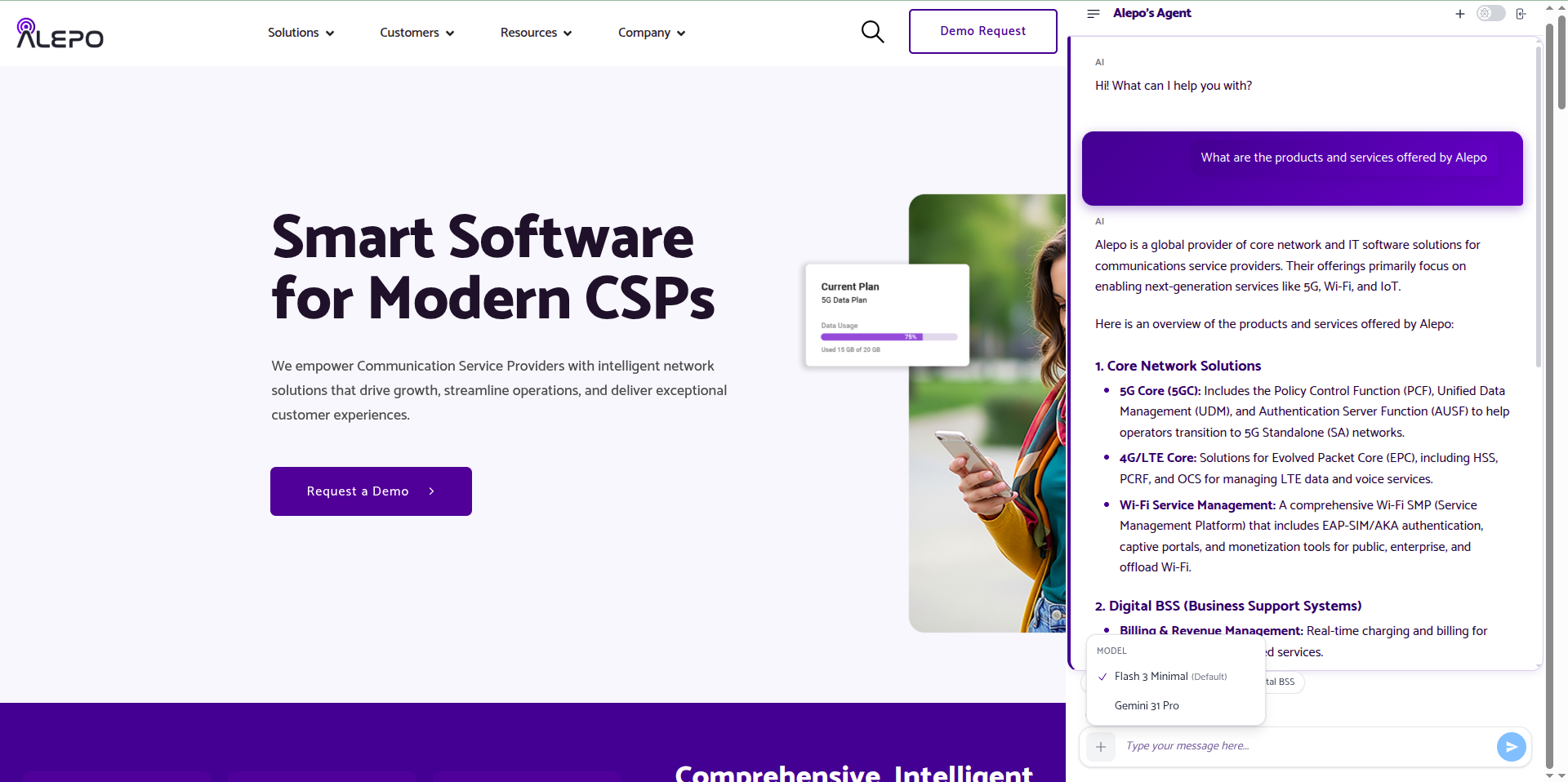
Current Sidebar rendered using the agent's embed script on a local example host. This shows the existing appearance; it does not demonstrate a new Custom CSS change.
After saving a CSS change, open the Sidebar on your embedding host and check the affected controls, readable text and keyboard focus. The floating-widget preview does not verify Sidebar styling.
When to use
Use Sidebar Custom CSS when the embedding host has its own design system (typography, color tokens, border radii) and you want the agent panel to inherit those visual conventions without rebuilding the theme palette.
Floating Widget Theme
A separate theme dropdown for the Floating Widget modality (e.g., Blue Ocean). This controls the overall color scheme of the embedded chat widget.
Component Customization
The Look & Feel page provides collapsible sections for fine-grained control over individual UI components:
Header
| Field | Description |
|---|---|
| Show Component | Toggle to show/hide the header |
| Background Color | Header background color (hex value) |
| Font Color | Header text color (hex value) |
| Text | Header display text (defaults to agent name) |
| Justify Content | Content alignment — Left, Center, Right |
| Link | Optional URL that the header links to |
| Widget Header Text (HTML) | Custom HTML for the header. Has higher precedence over the above configuration |
Usage Information
Customize the session usage cost display bar shown within the chat.
| Field | Description |
|---|---|
| Show Component | Toggle to show/hide the usage information bar |
| Background Color | Background color (hex) |
| Font Color | Text color (hex) |
| Justify Content | Content alignment (Left, Center, Right) |
| Font Size | Text size |
| Filter | Filter option |
Footer
Configure the footer area below the chat.
| Field | Description |
|---|---|
| Show Component | Toggle to show/hide the footer |
| Background Color | Footer background color (hex) |
| Font Color | Footer text color (hex) |
| Text | Footer display text (e.g., "Powered by...") |
| Justify Content | Content alignment (Left, Center, Right) |
| Link | URL the footer links to |
| Font Size | Text size |
| Widget Footer Text (HTML) | Custom HTML for the footer. Has higher precedence over the above configuration |
Sponsored
Configure a sponsored/branding banner in the chat interface.
| Field | Description |
|---|---|
| Show Component | Toggle to show/hide the sponsored section |
| Background Color | Background color (hex) |
| Font Color | Text color (hex) |
| Text | Display text (e.g., "Sponsored") |
| Justify Content | Content alignment (Left, Center, Right) |
| Link | URL the sponsored section links to |
| Font Size | Text size |
| Position | Placement — Below Header or other options |
Agent Message
Customize the appearance of AI agent messages in the chat bubble.
| Field | Description |
|---|---|
| Background Color | Message bubble background color (hex) |
| Font Color | Message text color (hex) |
| Border Radius | Bubble corner rounding (e.g., 10px) |
| Font Size | Message text size |
| Agent Icon URL | Custom icon URL displayed next to agent messages |
User Message
Customize the appearance of user messages in the chat bubble.
| Field | Description |
|---|---|
| Background Color | Message bubble background color (hex) |
| Font Color | Message text color (hex) |
| Border Radius | Bubble corner rounding (e.g., 10px) |
| Font Size | Message text size |
| User Icon URL | Custom icon URL displayed next to user messages |
Predefined Shortcuts
Customize the appearance of shortcut buttons displayed in the chat interface.
| Field | Description |
|---|---|
| Background Color | Button background color (hex) |
| Font Color | Button text color (hex) |
| Border Color | Button border color (hex) |
| Hover Background Color | Background color on mouse hover (hex) |
| Hover Font Color | Text color on mouse hover (hex) |
| Border Radius | Button corner rounding (e.g., 20px) |
| Font Size | Button text size |
Launcher Tooltip
Configure the tooltip that appears when users hover over or approach the chat launcher button (Floating Widget).
| Field | Description |
|---|---|
| Show Component | Toggle to show/hide the launcher tooltip |
| Background Color | Tooltip background color (hex) |
| Border Radius | Tooltip corner rounding |
| Initial Delay | Delay (in ms) before the tooltip first appears |
| Header Font Color | Header text color (hex) |
| Header Font Size | Header text size |
| Header Text | Tooltip header text (e.g., "We are online!") |
| Message Font Color | Message text color (hex) |
| Message Font Size | Message text size |
| Message Text | Tooltip message text (e.g., "How can I help you today?") |
Re-appearance Behavior:
| Setting | Description |
|---|---|
| Allow tooltip to re-appear | When enabled, the tooltip will show again after the specified interval even after the user has dismissed it |
| Re-show after | Duration (in minutes) before the tooltip re-appears. Recommended: 30 minutes to 2 hours. Range: 10 minutes to 24 hours |
Widget
Configure the overall widget container appearance and behavior.
| Field | Description |
|---|---|
| Action Pane Text Color | Text color in the action pane (hex) |
| Action Pane Background Color | Background color of the action pane (hex) |
| Widget Background | Overall widget background color (hex) |
| Launcher Animation | Toggle animation on the launcher button |
| Open Icon URL | Custom icon URL for the widget open state |
| Close Icon URL | Custom icon URL for the widget close state |
| Widget Custom CSS | Enter custom CSS rules for advanced styling beyond the provided options |
Floating Embed Widget Settings
Location
These settings are in a separate section within Agent Settings (not on the Look & Feel page). Navigate to the agent's Widget module to access them.
General Settings
| Setting | Description |
|---|---|
| Allow Users to Start a New Conversation | Enable/Disable — controls whether users can start a new conversation on the floating widget |
| Error Message | Custom message shown to end users instead of actual error messages when an error occurs (e.g., "Something went wrong!") |
| Allowed Domains | Restrict which domains can embed the widget (e.g., example.com, example2.com) |
Translation Settings
Open the separate Translation section in Agent Settings to configure these fields.
Language localisation for the Floating Widget, allowing it to adapt to the user's browser language settings. The widget detects the browser language and displays responses, shortcuts, buttons, and help text in the user's language.
| Setting | Description |
|---|---|
| Translation | Enable/Disable translation for the widget |
| Translation Language Model | The model used for translation tasks (e.g., Gemini 3 Pro Preview) |
| Translation Prompt | The system prompt instructing the model how to translate. A default prompt optimized for Anthropic models is provided |
Default Translation Prompt:
The default prompt instructs the model to:
- Translate JSON values to the target language specified by the language code
- Keep keys (left side of colon) in English, only translate values
- Not translate placeholders within curly braces (e.g.,
{data.name},{botParams.language}) - Not translate variable names or function names
- Maintain the original JSON structure
Widget Translations Management
Access stored translations via the three-dot menu under the agent or from agent cards. You can view, update, or delete stored translations based on access level. The Translation Settings section is permission-based — the role must have access to "Translation Settings."
Related Topics
- Agent Builder — Basic Configuration — Agent Info, modalities, and security settings
- Agent Builder — Advanced Configuration — Behavior settings and advanced customization