Agent Reports
Configure and view reports that surface agent performance, conversation metrics, and usage analytics — with a redesigned Query Builder and Live Preview workflow.
Overview
Agent Reports lets admins author reports against the agent's conversation data using a panel-based Query Builder with a live, inline Preview of the rendered report. The same reports power end-user dashboards rendered on Hubs.
Accessing Reports
- Navigate to MY AGENTS
- Click on the agent you want to view reports for
- Click the Reports option from the agent menu
Report Configuration — Query Builder
Start with a Conversation Count
Use this small example to check the reporting workflow before adding more dimensions:
- Open the agent's Reports and choose Add Report.
- In What To Count, select Conversations.
- Select Number as the visualization.
- Set Time Range to a period containing known test conversations.
- Inspect Preview. Compare the result with the intended agent, period and filters before saving.
- Add Break Down By or Filter By only after the basic count is understood. Use Sort & Limit when presenting grouped results.
- Choose Save to retain the report, or Cancel to leave the existing report unchanged.
On a rendered report, use Export CSV to inspect its data. A missing result can reflect the selected filters, permissions or retained data; it does not by itself establish that there was no activity. See Hub reporting for the separate Hub entry point.
The Query Builder groups every report control into clearly labelled, collapsible sections. A count badge on each section header (for example, What To Count (3)) shows what is currently configured at a glance.
Query Builder with What To Count and Sort & Limit expanded. This example counts conversations and displays a Number preview. Scroll the builder for additional controls.
| Section | Purpose |
|---|---|
| What To Count | Select what to count or aggregate (e.g., Agent Rating 1–5 Star, Conversations, Active Users). Includes a type-ahead search field and grouped categories such as Agent Sessions, Agents and Conversations |
| Break Down By | Choose dimensions to break the measure down by (e.g., date, user segment, agent version) |
| Filter By | Restrict the data — e.g., date range, status, conversation tag |
| Time Range | Select the period the report covers (preset or custom) |
| Sort & Limit | Sort the report and cap it to a top number of results. See below |
| Filters Viewers Can Change | Filters that end users viewing the rendered report can change themselves |
Renamed blocks
Four Query Builder blocks were relabelled in plainer language. If you are following older material, the mapping is:
| Was | Now |
|---|---|
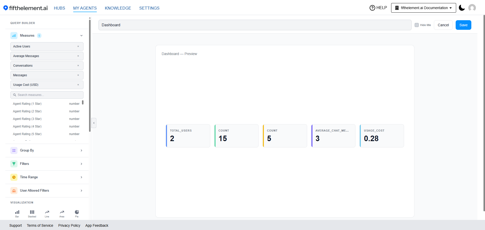
| Measures | What To Count |
| Group By | Break Down By |
| Filters | Filter By |
| User Allowed Filters | Filters Viewers Can Change |
Time Range keeps its name, and the visualization picker is unchanged.
Sort & Limit
When to use
Use Sort & Limit to restrict a report to a top number of results — "Top 5 Named Accounts" — without hand-editing the underlying query.
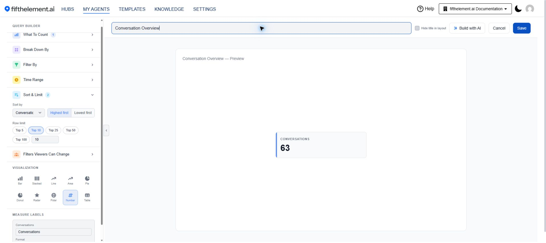
| Control | Description |
|---|---|
| Sort by | Which measure or dimension the report sorts on. Add a measure or dimension to the report first, then choose what to sort by |
| Row limit | One-click chips for Top 5, Top 10, Top 25, Top 50 and Top 100, plus a numeric field for another value |
Choose Highest first or Lowest first after selecting a sort field. Row limits cap the grouped results.
Build with AI
Build with AI sits in the report header alongside Cancel and Save. Describe a report in plain language, preview the result, refine it, then apply it to the Query Builder — the blocks above remain available for fine-tuning afterwards.
Nothing is written to the report until you accept it.
Human Agent Online-Time Measures
The Agent Sessions category in What To Count exposes measures derived from human agent login sessions in the Human Agent Console:
| Measure | Description |
|---|---|
| Login Sessions | Count of login / logout sessions |
| Total Logged In Time (seconds) | Total online time |
| Average Session Duration (seconds) | Mean length of a session |
| Active Sessions | Sessions currently open |
| Human Agents | Distinct human agents |
| Live Agents | Agents currently live |
Use the Time Range block to examine the retained login/logout data for the human agent and assistant. Confirm data availability and workspace retention before interpreting a historical report; an empty period does not by itself prove zero activity.
Visualization Picker
Pick from ten chart types directly in the panel, with the active selection highlighted:
| Type | Best For |
|---|---|
| Bar | Categorical comparisons |
| Stacked | Compositions inside categories |
| Line | Trends over time |
| Area | Trends with magnitude emphasis |
| Pie | Share-of-total breakdowns |
| Donut | Share-of-total with a center label |
| Radar | Multi-dimensional comparisons |
| Polar | Cyclic / directional comparisons |
| Number | A single KPI value |
| Table | Tabular detail |
Live Preview Pane
The configured report renders inline next to the builder so authors see the result as they edit. The toolbar offers a Hide title toggle plus prominent Cancel and Save actions.
Refreshed Dashboard Rendering
End-user dashboards (e.g., on Hubs) inherit the new visual treatment — KPI / Number cards, bar / pie / line / area charts, and table visualizations aligned to a single style, with per-chart time-range filters (e.g., All Time).
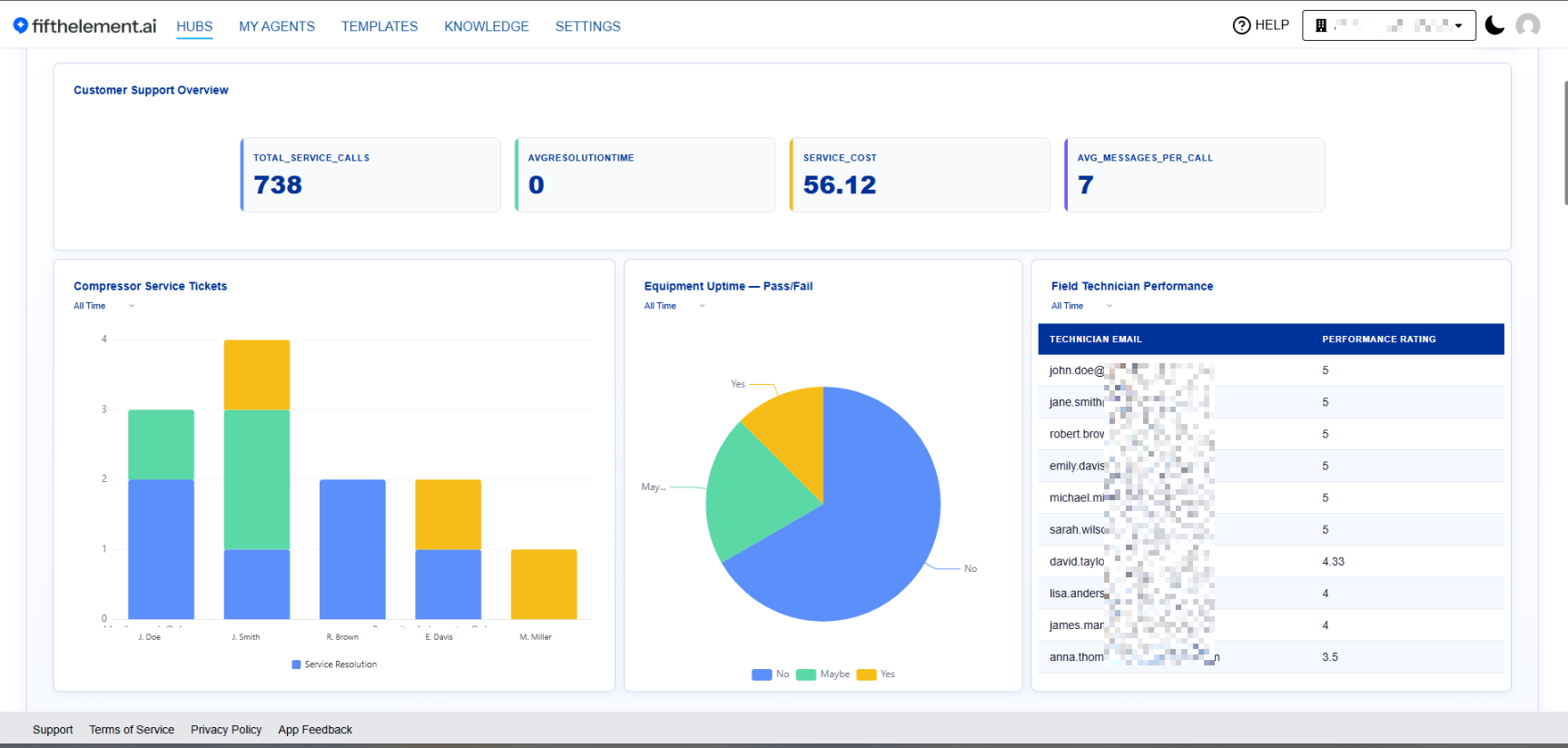
Hub dashboard showing stacked bar and pie charts with All Time and No Grouping controls. Email labels are blurred.
Report Explain
Dashboard consumers can ask what a chart is actually telling them. Report Explain produces an on-demand AI explanation of a report widget.
Like the other AI-assist flows, it is draft-then-apply — the explanation is presented for review rather than written into the report.
Exporting Reports
Use Export CSV on a rendered report card to download its data.
Related Topics
- Agent Builder — Configure your agents
- Conversations — View conversation history
- Hubs — Managing Hubs — Surface reports as Hub dashboards
- Version Control — Track agent changes